
After the U.S. housing market experienced years of rapid growth in active home listings, its inventory levels appear at first glance to have reached a stable plateau.
But a closer look reveals that this plateau in the national inventory numbers is hiding a tug-of-war between markets on extreme ends of the inventory spectrum.
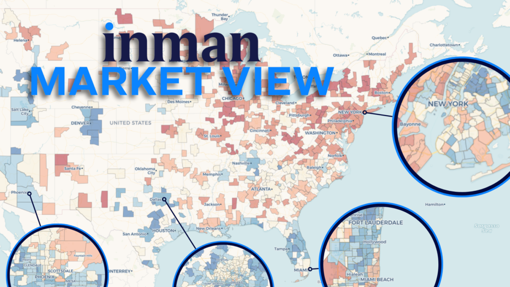
This phenomenon becomes clear when examining listing data from Realtor.com through the lens of Inman Market View’s interactive tools, available to all Inman subscribers. And in some places, the extremes are only continuing to accelerate.
- The number of active listings remained 14 percent below pre-pandemic levels for the three months ending in April — roughly the same level of inventory as the previous June.
While housing inventory has settled into a level a bit below what was considered normal in the years leading up to the pandemic, we can see there’s wide variation by region.
The map below demonstrates just how much inventory was warped and stretched by the initial pandemic shock, the resulting boom in demand for homes, and the resulting crash in transactions and rebalancing in inventory that followed.
Click into one of the 500 local markets in the tool above, or search for an option in the drop-down menu for an even more detailed look at the data. Select different metrics and time-period comparisons for a fuller picture.
In more recent months, new momentum in some of America’s largest housing markets suggests some markets may be converging with the national picture — while others find themselves further out on a limb.
Fork in the road
Real estate agents and brokerages in dozens of major markets are still seeing substantial shifts in their inventory.
In some Florida markets, a glut of inventory that had built up over the course of multiple years is now either being absorbed or withdrawn from the market.
- Active-listing levels in Southwest Florida — specifically the metro area that encompasses Cape Coral and Fort Myers — saw inventory levels fall from 45 percent above pre-pandemic levels a year ago to 24 percent above that same baseline in the three-month period ending in April.
- The same pattern can be observed in several other large Florida markets ranging from Miami to Jacksonville.
(Compare your market’s path to others by selecting it in the drop-down menu above. You can also toggle between different metrics and comparison views.)
Perhaps more extreme is the rapid growth in active listings in some of the nation’s largest, most active tech hubs.
- Inventory in the greater Seattle area, already 32 percent above pre-pandemic levels this time last year, has since ballooned to 81 percent above the norm.
And Seattle’s not alone.
What all of these tech destinations — and others like Austin — have in common is a recent increase in new listings, along with a sudden reduction in properties leaving the market due to either a pending sale or a delisting, an analysis of Realtor.com data suggests.
These diverging trends appear to be largely canceling each other out in the national numbers. But they serve as a good reminder that American real estate remains a local game.
It also remains split between the haves and have-nots.
A market split by class
As home prices stagnate and the stock market continues its climb to new highs, Americans holding significant financial assets are in an increasingly better position to buy a home than those whose wealth is largely tied to their primary residence.
And we see the clear fingerprint of this in Miami.
One way we can estimate demand for homes is by looking at the number of properties that left the market in the last three months — most due to a pending sale, and a smaller number due to delisting — and dividing them by the number of active listings for sale at a given point in time.
We can see that the parts of this region where demand is unusually high are in the “blue” ZIP codes along the Miami waterfront.
These are also the places where the price for a typical unit is highest, as seen in the map below. And in lower-priced areas, demand for a typical listing is lower than it was in a pre-pandemic Miami.
You can explore your own market by selecting it in the dropdown menu above, and toggling between different metrics and time-period comparisons.


