
In spite of this multi-year transaction downturn amid elevated mortgage rates, home values in most parts of the country have held firm.
But some of the places that saw the weakest price growth during the early pandemic housing boom are experiencing a newfound surge in cautious pricing by agents and their clients, according to an Inman analysis of the most recent data from Realtor.com.
And this trend is contributing to modest list-price downturn nationwide heading into the spring and summer seasons, even as many agents expect a healthy uptick in sales.
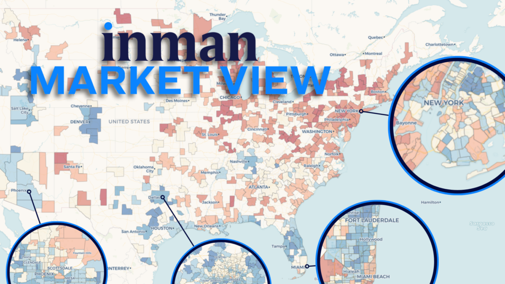
Explore the Inman Market View interactive data tools on this page to see how your market compares.
Click into one of the 500 local markets in the tool above, or search for an option from the drop-down menu for an even more detailed look at the data. Select different metrics and time-period comparisons for a fuller picture.
A conservative ask
Nationally, price growth has continued to weaken — a trend that is now reflected homesellers’ asking prices.
- Home listings this winter were initially priced 44 percent above their pre-pandemic levels for that time of year, a sign of just how much the pandemic boom continues to weigh on affordability today.
- But that list-price mark was down from 47 percent above pre-pandemic norms in the fall market of 2025.
At the local level, this is playing out in sharply diverging ways.
Some major markets — including the greater New York City and Miami metro areas — are seeing signs of price stabilization, where sellers are regaining confidence when setting their asking prices.
But more places are seeing strategic lower listing prices on the eve of the spring season. And a few markets are seeing more dramatic downward pressure on prices.
Cumulative gain in listing price from pre-pandemic “normal”
Fall market → Winter market
- Greater Austin area: +34% → +27%
- Greater Silicon Valley area: +25% → +18%
- Greater Washington, D.C., area: +31% → +25%
These three cases are more extreme than the typical U.S. market, and each have their own stories that help explain their recent loss of pricing momentum.
But the regional employment hubs do share a couple traits in common: They’ve either enjoyed or retained less price growth from the pandemic boom years, and they’ve seen recent upswings in active-listing inventory.
In the cases of Austin and Silicon Valley, the supply of homes is being supported by an unusually large surge in new listings since the start of the year.
You can use the Inman Market View charts above to search for your own market and compare its trajectory to others across an array of metrics and time comparisons.
Inside a market
The weak price trends in the nation’s capital may not have as clean an explanation as other markets that have experienced steep price reductions.
While the map below shows that neighborhoods throughout the greater D.C. area have participated in list-price declines over the past year, some of the areas hardest-hit have been wealthier enclaves well outside of the district itself.
Instead of being simply a “federal workforce layoffs” story, this suggests the biggest price shifts near D.C. might be related to top-level administration and agency leadership turnover, the fate of high-value government contracts and other specialized labor classes living near the nation’s seat of government.
For most markets, the price reductions have been nowhere near this steep. Many places are even seeing prices continue to rise or gain their footing.
But if prices continue to soften in more and more metros throughout the U.S., it could have implications for how many clients choose to list — and buy — this spring.
Methodology note: When calculating the 2017-19 baseline averages for each metric this month, Inman adjusted its approach to better handle the December-to-January jump each year. The underlying concept remains unchanged, but the trends should be smoother and more comparable from December to January.


